


Qlikview dashboard reminds me of an old adage, “A picture is worth a thousands words”.
But, an ambiguous picture can cost millions in lost opportunity and market share as well.
You can invest millons of dollars to build a state-of-the-art data warehouse and Business Intelligence software, but if users don’t know how to make sense of data, your efforts go in vain.
I am a big fan of Stephen Few for his depth of knowledge on visual perception — what works, what doesn’t and why. Most business discovery tools such as Qlikview and Tableau are heavily dependent on their visual aspects, but they also have an Achilles’s hill: If designer can’t provide data that tells the story or the state of the business clearly to the decision makers then nothing matters.
With that in mind, in this Qlikview tutorial, I have created a simple Qlikview dashboard to show how you can use simple yet effective ways to provide visual perception for your executives.
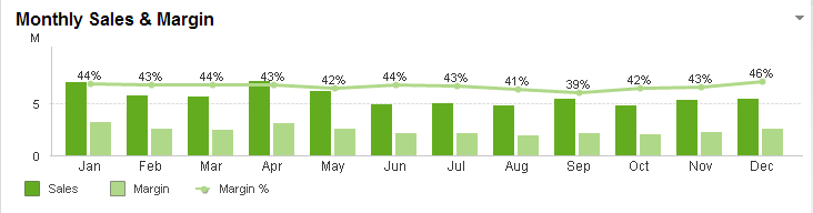
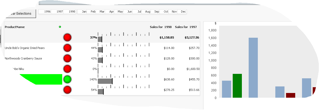
I have often seen a pie chart or a gauge chart — with all the flash and dazzle — that seldom tells the story elegantly. Let’s explore an example of how to use simple green and red light images visually depict the trend such as year-over-year product sales.
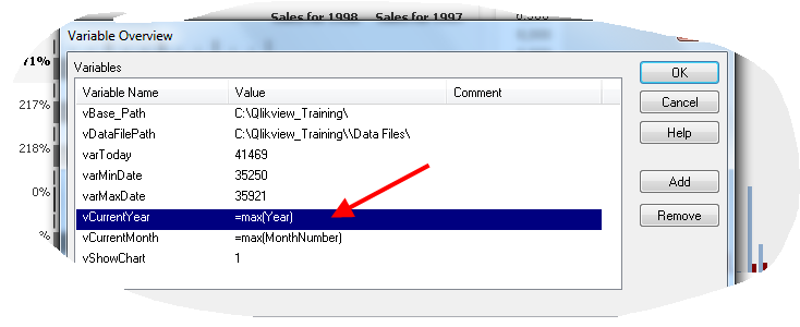
Step 1: Create two variables for the current year and current month values.
Step 2: Create a chart with ProductName as a dimension and several expressions: Image, text, linear gauge(Expression –> Display options –> Representation)
Add an expression with image representation first.
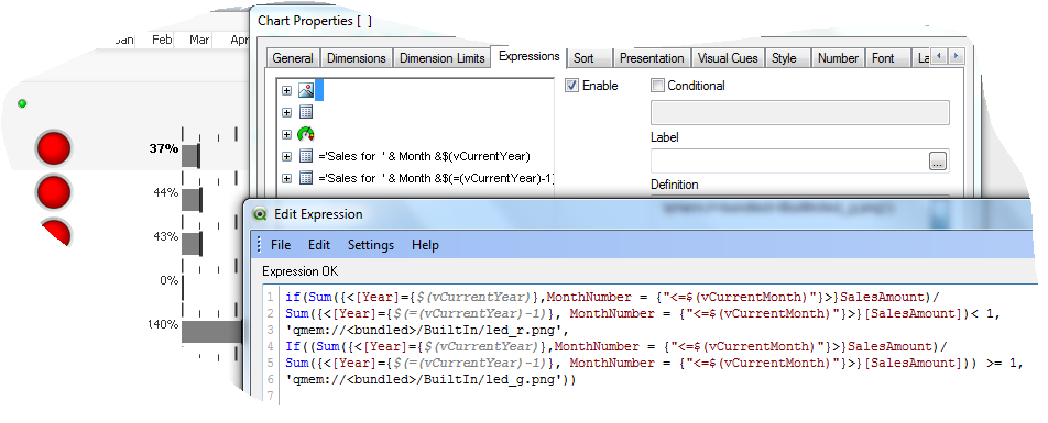
Remember: You can load various images from Qlikview by selecting Image drop down list under the expression tab. Once you select an image and paste it in your expression, Qlikview will automatically add ‘qmem:///BuiltIn/image_name’ to your script.
Step 3: Add a linear gauge to provide a year-over-year product sales comparison.
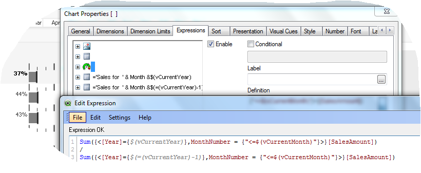
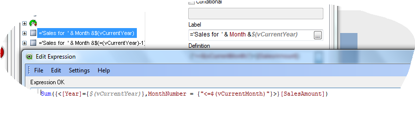
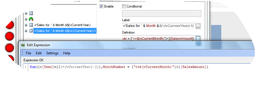
Step 4: Now, create two additional expressions to compare year-over-year sales.
For the current year:
For the Previous year:
Step 5: Finally, create a bar chart to show year-over-year sales by Product Name.
Elsewhere:
Fine Tuning Your Object Dimensions via LivingQlikview.com
Effective Visual Communication via Qlikview Notes
Courtesy: Qlikview executive dashboard

Gillian Mackenzie 11:52 am on January 21, 2014 Permalink
Hi
Really like the ‘look’ of your chart. Alas, I can not find a Representation drop down in the Chart Properties dialog Expression tab. Am I missing a trick somewhere? Using 11.20.11718.0 SR1 64bit personal edition. Many thanks.
Shantanu 11:04 am on August 14, 2014 Permalink
HI,
The charts and video looks cool ! Could you please explain which component being used and how to use it to have a similar format like the one you showed in 1st chart.
I create a gauge expression as yours, but what gauge settings should be done to get the similar format.
Thanks