


Data visualization is a double-edged sword: when used properly, it can help uncover trends and outliers or it can mislead your users.
Choosing the proper chart type for each visualization is essential to create an effective data visualization.
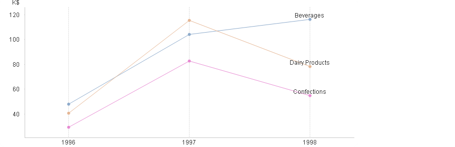
For example, line charts are best fit to show time-series relationship with continuous data. They are used to show trends, acceleration, declaration and volatility.
As a QlikView designer, I focus on the following three aspects of a line chart in my data visualization.
1. Maximize data-ink
2. Don’t plot more than 4 lines
3. Label each line instead of using legend
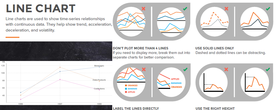
The Data Ink
Simply put, data ink represents pixels on the screen that directly reflect the data, such as a line in a line chart.
However, often a chart contains elements such as captions, shadows and borders that do not directly reflect data. As a QlikView designer, try to maximize data ink.
Why use 4 or fewer lines?
How often have you heard that we can hold seven items (plus or minus two) in our short-term memory? Short-term, or working, memory, is ‘‘the collection of mental processes that permit information to be held temporarily in an accessible state, in the service of some mental task’’ (Cowan, 1998, p. 77).
More recent sources agree that, yes, there is a limit to how many new elements we can hold in working memory (Clark, 2010; Cowan, 1998; Luck & Vogel, 1998). However, they suggest that the limit is more like three or sometimes four items or chunks. — Jeane Farrington
Line labels
Labeling lines directly lets your users identify lines and corresponding labels instead of referencing a legend. It avoids confusion and aids cognitive ability of your users to gain insight quickly.
Do you want to learn these best practices and more? Enroll in my QlikView designer course on udemy.

John 2:40 pm on August 24, 2015 Permalink
Great example. Have you labeled the lines by creating three different expressions?
Please can you explain how you did this in QlikView.
Shilpan 5:11 pm on September 5, 2015 Permalink
Hi John,
Sure — I will show you that in the next article.
Michael 10:31 am on September 25, 2015 Permalink
I think those advises can be good only in some situations. In other, they don’t make much sense. I may need 7 or 12 lines to compare days or months. I may need dotted lines to see estimations, time discontinuities… I may need big axes to see small and big trends at the same time and yeah, how you set dynamically located labels in your graphic?
Real life is not the lab, where things and circumstances occur one by one, isolated, etc. In real life things come unexpectedly time and space weirdly mixed. We can’t define rules for every single thing.